Understanding Gradient Boosting Internals: From Pseudo-Residuals to XGBoost
Introduction
I’ve used XGBoost in multiple projects and it almost always performs well on tabular data. But for a long time I treated it like a black box - I knew which knobs to turn, but not why turning them worked. When does the learning rate actually matter? What is the model doing between tree 1 and tree 200? What does gamma actually penalize?
This post is my attempt to make gradient boosting feel intuitive rather than magical. We’ll use a hospital readmission prediction problem as our running example - not because it’s exotic, but because it has the kind of real-world messiness (mixed feature types, class imbalance, clinical stakes) that makes the algorithm’s behavior interesting to watch.
All the code below is copy-pasteable and runs on your laptop in under a minute. I’d encourage you to actually run it, change the parameters I point out, and see what breaks or improves.
Setting Up: A Synthetic Hospital Dataset
Before we dive into the algorithm, let’s create a dataset we can work with throughout this post. We’ll simulate 3,000 patients with features like age, creatinine levels, BMI, and prior hospital admissions. The target is whether they were readmitted within 30 days.
import numpy as np
import pandas as pd
import matplotlib.pyplot as plt
from sklearn.model_selection import train_test_split
from sklearn.metrics import roc_auc_score, classification_report
import xgboost as xgb

np.random.seed(42)
N = 3000

age             = np.random.normal(65, 15, N).clip(18, 95)
creatinine      = np.random.exponential(1.2, N).clip(0.5, 12)   # kidney marker
bmi             = np.random.normal(28, 6, N).clip(16, 55)
num_comorbid    = np.random.poisson(2.5, N).clip(0, 8)           # number of conditions
los_days        = np.random.exponential(5, N).clip(1, 30)        # length of stay
prev_admissions = np.random.poisson(1.0, N).clip(0, 6)
heart_rate_bpm  = np.random.normal(78, 15, N).clip(45, 140)

# Readmission risk increases with prior admissions, comorbidities, creatinine
logit = (-3.5
         + 0.025 * age
         + 0.30  * creatinine
         - 0.02  * bmi
         + 0.40  * num_comorbid
         + 0.08  * los_days
         + 0.50  * prev_admissions
         + np.random.normal(0, 0.5, N))

readmission_30d = (1 / (1 + np.exp(-logit)) > 0.5).astype(int)

df = pd.DataFrame({
    "age": age,
    "creatinine_mg_dl": creatinine,
    "bmi": bmi,
    "num_comorbidities": num_comorbid,
    "los_days": los_days,
    "prev_admissions": prev_admissions,
    "heart_rate_bpm": heart_rate_bpm,
    "readmission_30d": readmission_30d,
})

X = df.drop("readmission_30d", axis=1)
y = df["readmission_30d"]
X_train, X_test, y_train, y_test = train_test_split(X, y, test_size=0.2, random_state=42)

print(f"Patients: {len(df)}")
print(f"Readmission rate: {y.mean():.1%}")
print(df.describe().round(2))
The logit formula encodes real clinical intuition: patients with more prior admissions and more comorbidities are more likely to be readmitted. Elevated creatinine signals kidney dysfunction, which is a known readmission driver. This gives us a dataset where the patterns are realistic, even though the data is synthetic.
Just Run the Model First
Before explaining anything, let’s train a working XGBoost model and see what it produces. Understanding comes after seeing the result.
model = xgb.XGBClassifier(
    n_estimators=200,
    max_depth=4,
    learning_rate=0.1,
    subsample=0.8,
    colsample_bytree=0.8,
    eval_metric="logloss",
    random_state=42,
)
model.fit(X_train, y_train, eval_set=[(X_test, y_test)], verbose=False)

y_prob = model.predict_proba(X_test)[:, 1]
print(f"Test ROC-AUC: {roc_auc_score(y_test, y_prob):.4f}")
print()
print(classification_report(y_test, model.predict(X_test),
                             target_names=["No Readmit", "Readmit"]))

# Which features mattered most?
feat_imp = pd.Series(model.feature_importances_, index=X.columns).sort_values()
feat_imp.plot(kind="barh", figsize=(8, 4), color="#2196F3")
plt.title("Feature Importance - 30-Day Readmission Model")
plt.xlabel("Importance score")
plt.tight_layout()
plt.show()
You should see an AUC around 0.85. The feature importance chart will put prev_admissions and num_comorbidities at the top - which matches how we built the data. That’s a good sign the model is learning the right signals.
Now the question: how did 200 trees produce this result?
The Core Idea: Gradient Boosting Is a Correction Chain
Imagine you’re a teacher grading practice exams. After the first exam, you notice your student keeps getting a specific type of question wrong - say, questions about drug interactions. Instead of re-teaching everything, you focus the next session entirely on drug interactions. After the second session, they’ve improved on that, but now there’s a new weak spot. You keep targeting whatever they’re getting wrong.
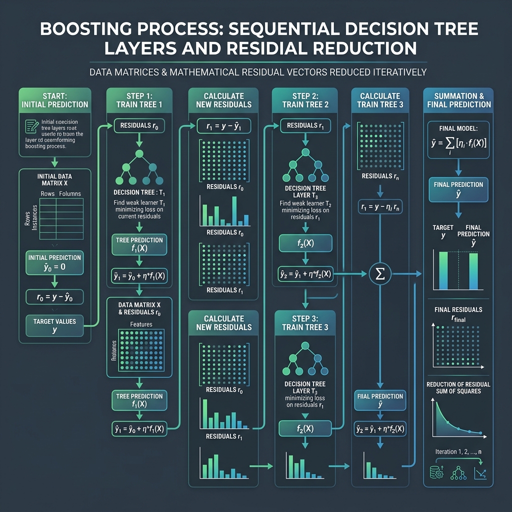
That’s exactly what gradient boosting does. Instead of one big model that tries to learn everything at once, it builds a chain of small corrective models. Each new tree focuses on the mistakes the previous trees made.
These “mistakes” have a technical name: pseudo-residuals. For a patient who was actually readmitted (label = 1) but our model only predicts a 30% readmission probability, the pseudo-residual is 1 - 0.3 = 0.7. The next tree tries to explain that remaining 0.7 gap. For a patient predicted at 90% who wasn’t readmitted, the residual is 0 - 0.9 = -0.9 - a strong signal to push the prediction back down.
Let’s implement this loop by hand to make it concrete:
from sklearn.tree import DecisionTreeRegressor

# Simplified 2-feature version to keep the loop readable
n = 500
prev_admit = np.random.poisson(1.2, n)
comorbid   = np.random.poisson(2.0, n)
readmitted = ((prev_admit * 0.5 + comorbid * 0.4 + np.random.randn(n) * 0.5) > 1.5).astype(float)
X_toy      = np.column_stack([prev_admit, comorbid])

# Start with the simplest possible prediction: the overall readmission rate
F      = np.full(n, readmitted.mean())   # everyone gets the same starting score
lr     = 0.1
losses = []

for round_number in range(80):
    # Convert the current score to a probability (0 to 1)
    current_probability = 1 / (1 + np.exp(-F))

    # The "mistakes": how far off is each patient's predicted probability?
    pseudo_residuals = readmitted - current_probability   # ← this is the key line

    # Train a small tree to predict these mistakes - NOT the original labels
    correction_tree = DecisionTreeRegressor(max_depth=2, random_state=round_number)
    correction_tree.fit(X_toy, pseudo_residuals)

    # Apply a fraction of the correction
    F += lr * correction_tree.predict(X_toy)

    # Track how wrong we still are overall
    loss = -np.mean(
        readmitted * np.log(current_probability + 1e-9) +
        (1 - readmitted) * np.log(1 - current_probability + 1e-9)
    )
    losses.append(loss)

plt.figure(figsize=(8, 4))
plt.plot(losses, color="#E53935", linewidth=2)
plt.title("Loss Over 80 Boosting Rounds - Mistakes Getting Smaller Each Round")
plt.xlabel("Round number")
plt.ylabel("How wrong we are (lower = better)")
plt.grid(alpha=0.3)
plt.tight_layout()
plt.show()

print(f"Round 1  loss: {losses[0]:.4f}")
print(f"Round 80 loss: {losses[-1]:.4f}")
The chart shows the loss dropping each round. Each dip corresponds to one correction tree reducing the remaining mistakes. The important thing to notice: correction_tree.fit(X_toy, pseudo_residuals) - we’re fitting to the residuals, not to readmitted. The tree is learning “here’s where the current model is wrong and by how much,” not “here’s the original target.”
Try this: Change max_depth=2 to max_depth=1 and re-run. The loss still drops but more slowly. A depth-1 tree can only ask one question (“is prev_admissions > X?”) - like a teacher who can only focus on one topic per session instead of connecting topics. More depth means more complex corrections each round.
What the Learning Rate Actually Does
The learning rate (lr = 0.1 above) controls how much of each correction to apply. Think of it like adjusting the temperature on a radiator: you could crank it all the way up and overshoot into too-hot, or turn it up slowly and land right where you want it.
In gradient boosting, a learning rate of 1.0 means: “apply the full correction from each tree.” A rate of 0.1 means: “apply 10% of the correction, and leave the rest for future trees to refine.” Lower rates produce smoother, more careful learning - but need more trees to get there.
def run_gbdt(X, y, learning_rate, n_rounds=120):
    """Run the manual GBDT loop and return the loss at each round."""
    F = np.full(len(y), y.mean())
    losses = []
    for t in range(n_rounds):
        p = 1 / (1 + np.exp(-F))
        residuals = y - p
        tree = DecisionTreeRegressor(max_depth=2, random_state=t)
        tree.fit(X, residuals)
        F += learning_rate * tree.predict(X)
        loss = -np.mean(y * np.log(p + 1e-9) + (1 - y) * np.log(1 - p + 1e-9))
        losses.append(loss)
    return losses

fig, ax = plt.subplots(figsize=(9, 4))
for lr_val, color, label in [
    (0.01, "#2196F3", "lr=0.01  (cautious - needs many rounds)"),
    (0.10, "#4CAF50", "lr=0.10  (balanced)"),
    (0.50, "#E53935", "lr=0.50  (aggressive - can overshoot)"),
]:
    ax.plot(run_gbdt(X_toy, readmitted, lr_val), color=color, linewidth=2, label=label)

ax.set_title("Three Learning Rates - Same Problem, Very Different Behaviour")
ax.set_xlabel("Round number")
ax.set_ylabel("Loss")
ax.legend()
ax.grid(alpha=0.3)
plt.tight_layout()
plt.show()
The three curves tell the story: lr=0.01 is like turning the radiator up one degree at a time - it’ll get there, but slowly. lr=0.10 hits a good balance. lr=0.50 drops fast but risks overshooting.
There’s a practical rule of thumb here: keep learning_rate × n_estimators roughly constant. If you halve the learning rate (from 0.1 to 0.05), double the number of trees. The total “budget” of corrections stays the same, but each one is smaller and more precise.
Try this: Set learning_rate=2.0 and run just 30 rounds. Watch what happens to the loss curve. The corrections are so large that the model keeps overshooting in both directions - like yanking a steering wheel too hard trying to stay in your lane.
Tree Depth: How Complex Can Each Correction Be?
The max_depth parameter controls how many conditions each correction tree can express. Depth 1 means one condition: “if prev_admissions > 2, then predict this.” Depth 3 means three chained conditions: “if prev_admissions > 2 AND creatinine > 1.5 AND los_days > 7, then predict this.”
Think of it like the difference between a single-question quiz (“did you pass the drug interaction question?”) versus a diagnostic test that narrows down the exact subtopic you’re struggling with. More depth = more precise correction, but also more risk of memorizing specific patients rather than learning general patterns.
On tabular medical data, depth 4–6 almost always hits the sweet spot. Let’s verify:
print(f"{'max_depth':<12} {'Train AUC':>10} {'Test AUC':>10} {'Overfit gap':>12}")
print("-" * 48)

for depth in [1, 3, 4, 6, 10]:
    m = xgb.XGBClassifier(
        n_estimators=200, learning_rate=0.1, max_depth=depth,
        eval_metric="logloss", random_state=42
    )
    m.fit(X_train, y_train, verbose=False)
    train_auc = roc_auc_score(y_train, m.predict_proba(X_train)[:, 1])
    test_auc  = roc_auc_score(y_test,  m.predict_proba(X_test)[:, 1])
    gap       = train_auc - test_auc
    flag      = " ← overfitting" if gap > 0.06 else ""
    print(f"{depth:<12} {train_auc:>10.4f} {test_auc:>10.4f} {gap:>12.4f}{flag}")
The “overfit gap” (train AUC minus test AUC) is your early warning system. A small gap means the model is learning general patterns. A large gap means it’s memorizing individual training patients - those patterns won’t hold up when you deploy the model to a new hospital’s patients.
Try this: Set max_depth=10 and look at the train AUC (will be near 1.0) versus test AUC. The model has essentially memorized the 2,400 training patients but learned nothing useful about new ones. This is what overfitting looks like in practice.
Regularization: Putting a Leash on the Corrections
XGBoost adds two parameters that vanilla gradient boosting doesn’t have:
-
reg_lambda(L2 regularization) - penalises leaf scores that are too extreme. Imagine a doctor who always hedges their predictions (“probably readmitted, but I’m not 100% sure”) rather than making bold confident calls. This prevents the model from making extreme predictions on rare patient subgroups it’s barely seen. -
gamma- the minimum improvement a split must provide to be worth making. Like a quality control rule: “don’t make a split unless it genuinely reduces the error by at least this much.” Small errors that a deep tree would chase just get ignored.
configs = {
    "No regularization (λ=0, γ=0, depth=6)":  dict(reg_lambda=0,  gamma=0, max_depth=6),
    "XGBoost defaults (λ=1, γ=0, depth=4)":   dict(reg_lambda=1,  gamma=0, max_depth=4),
    "Heavy regularization (λ=10, γ=5, depth=3)": dict(reg_lambda=10, gamma=5, max_depth=3),
}

print(f"{'Config':<42} {'Train AUC':>10} {'Test AUC':>10} {'Gap':>8}")
print("-" * 74)

for name, params in configs.items():
    m = xgb.XGBClassifier(
        n_estimators=200, learning_rate=0.1, subsample=0.8,
        eval_metric="logloss", random_state=42, **params
    )
    m.fit(X_train, y_train, verbose=False)
    train_auc = roc_auc_score(y_train, m.predict_proba(X_train)[:, 1])
    test_auc  = roc_auc_score(y_test,  m.predict_proba(X_test)[:, 1])
    print(f"{name:<42} {train_auc:>10.4f} {test_auc:>10.4f} {train_auc - test_auc:>8.4f}")
The gap column tells the story. No regularization → big gap → model is overfit, won’t generalize to a new hospital’s patients. Default settings → balanced. Heavy regularization → tiny gap, but you’ve given up a bit of performance to get there.
The right choice depends on your dataset size. With only a few hundred patients, you’d want heavier regularization because there isn’t enough data to support complex trees. With tens of thousands, the defaults usually work fine.
Early Stopping: Letting the Data Tell You When to Stop
Picking n_estimators=200 is a guess. Sometimes 80 trees is enough. Sometimes you need 400. Early stopping removes the guesswork: you set a high ceiling and let the validation performance tell you when adding more trees stops helping.
Think of it like baking a cake. Instead of setting a timer and hoping, you check the toothpick every few minutes. When it comes out clean, you stop - not when the timer goes off.
X_tr, X_val, y_tr, y_val = train_test_split(X_train, y_train, test_size=0.125, random_state=1)

model_es = xgb.XGBClassifier(
    n_estimators=2000,         # high ceiling - we won't reach this
    learning_rate=0.05,        # slower learning = more visible plateau
    max_depth=4,
    subsample=0.8,
    eval_metric="auc",
    early_stopping_rounds=30,  # stop if no improvement for 30 consecutive rounds
    random_state=42,
)
model_es.fit(
    X_tr, y_tr,
    eval_set=[(X_tr, y_tr), (X_val, y_val)],
    verbose=False,
)

print(f"Stopped at round : {model_es.best_iteration}")
print(f"Best val AUC     : {model_es.best_score:.4f}")
print(f"Final test AUC   : {roc_auc_score(y_test, model_es.predict_proba(X_test)[:, 1]):.4f}")

# Plot the train vs validation AUC over rounds
results = model_es.evals_result()
plt.figure(figsize=(9, 4))
plt.plot(results["validation_0"]["auc"], label="Training AUC",   color="#1976D2", linewidth=1.5)
plt.plot(results["validation_1"]["auc"], label="Validation AUC", color="#43A047", linewidth=1.5)
plt.axvline(model_es.best_iteration, color="#E53935", linestyle="--",
            label=f"Best round: {model_es.best_iteration}")
plt.xlabel("Round")
plt.ylabel("AUC")
plt.title("Early Stopping: Training Keeps Improving, Validation Plateaus")
plt.legend()
plt.grid(alpha=0.3)
plt.tight_layout()
plt.show()
The chart shows the critical pattern: training AUC keeps climbing (the model keeps getting better on the training patients) but validation AUC flattens and then slightly drops. The red line is where we stopped - any rounds after that point are the model memorizing noise rather than learning patterns.
Try this: Change early_stopping_rounds=30 to early_stopping_rounds=5. You’ll stop earlier, possibly before the model has fully converged. Then try 100 - you’ll let it overfit a bit more before catching it. The right value depends on how noisy your validation curve looks; 20–50 is a good range.
SHAP: Why Did the Model Flag This Patient?
Imagine you run the model on a patient and it predicts 82% readmission risk. A clinician asks: “why?” A ROC-AUC of 0.85 doesn’t answer that. SHAP does.
SHAP (SHapley Additive exPlanations) gives each feature a score for each individual prediction. The score answers: “how much did this specific feature push this patient’s risk above or below the average?” Positive score = pushed risk up. Negative = pushed it down.
It’s like getting a breakdown of a restaurant bill. The total is $85, but you want to know how much was food ($60), drinks ($15), and the dessert you added at the end ($10). SHAP does the same thing for a model’s prediction.
import shap

explainer   = shap.TreeExplainer(model)
shap_values = explainer.shap_values(X_test)

# Find the patient we're most worried about
highest_risk_idx  = np.argmax(model.predict_proba(X_test)[:, 1])
highest_risk_prob = model.predict_proba(X_test)[highest_risk_idx, 1]

print(f"Highest-risk patient: {highest_risk_prob:.1%} readmission probability")
print(f"\nWhat drove this prediction (sorted by impact):")
print(f"{'Feature':<25} {'SHAP score':>12}   Direction")
print("-" * 55)

for feat, val in sorted(zip(X_test.columns, shap_values[highest_risk_idx]),
                         key=lambda x: abs(x[1]), reverse=True):
    direction = "↑ increases risk" if val > 0 else "↓ reduces risk"
    print(f"  {feat:<23} {val:>+10.3f}   {direction}")
Then the global view - which features tend to matter most across all patients:
shap.summary_plot(shap_values, X_test, show=False, plot_size=(10, 5))
plt.title("SHAP Summary: What Drives Readmission Risk Across All Patients")
plt.tight_layout()
plt.show()
The beeswarm plot shows every patient as a dot. Features at the top are the most influential overall. A dot far to the right means that feature value pushed someone’s risk up significantly; far to the left means it pushed risk down. You’ll see prev_admissions at the top with a wide spread - patients with high prior admissions are being flagged heavily, which is exactly what the clinical literature would predict.
Try this: Run the same SHAP breakdown for the lowest-risk patient and compare it to the highest-risk one. Look at which features flipped direction. This is how you build intuition for what the model considers a “safe” patient profile versus a “high-risk” one.
lowest_risk_idx = np.argmin(model.predict_proba(X_test)[:, 1])
print(f"\nLowest-risk patient: {model.predict_proba(X_test)[lowest_risk_idx, 1]:.1%} readmission probability")
for feat, val in sorted(zip(X_test.columns, shap_values[lowest_risk_idx]),
                         key=lambda x: abs(x[1]), reverse=True):
    direction = "↑" if val > 0 else "↓"
    print(f"  {feat:<23} {val:>+8.3f}  {direction}")
One More Thing: Calibration
There’s a difference between a model that ranks patients correctly (AUC measures this) and a model whose probability numbers are accurate (calibration measures this). A model could rank all 3,000 patients in perfect order but still output “75% readmission risk” for patients who are actually readmitted at a 50% rate.
In a clinical setting this matters: if a care manager acts on readmission probabilities to allocate resources, the actual numbers need to be trustworthy, not just their ranking.
from sklearn.calibration import calibration_curve

prob_true, prob_pred = calibration_curve(y_test, y_prob, n_bins=10)

plt.figure(figsize=(6, 5))
plt.plot(prob_pred, prob_true, "s-", color="#2196F3", label="XGBoost predictions")
plt.plot([0, 1], [0, 1], "k--", alpha=0.5, label="Perfectly calibrated")
plt.xlabel("Predicted readmission probability")
plt.ylabel("Actual readmission rate in this group")
plt.title("Calibration Check: Are the Probabilities Trustworthy?")
plt.legend()
plt.grid(alpha=0.3)
plt.tight_layout()
plt.show()
If the blue curve hugs the diagonal, the probabilities are accurate. If it bows above or below, the model is systematically overconfident or underconfident. When calibration is off, you fix it with sklearn.calibration.CalibratedClassifierCV - but checking it first is the important step most people skip.
Summary: What to Experiment With
Here’s a quick reference for the experiments worth trying yourself:
| What to change | What you’ll see | Why it matters |
|---|---|---|
max_depth=1 vs max_depth=10 |
Train/test AUC gap grows at depth 10 | Deeper trees = more overfit risk |
learning_rate=2.0 |
Loss curve diverges | Corrections overshoot the target |
reg_lambda=0, gamma=0 |
Large train-test gap | No penalty on extreme predictions |
early_stopping_rounds=5 vs 100 |
Stop too early vs too late | Validation plateau is the right stopping signal |
Drop prev_admissions from features |
AUC drops noticeably | Most influential feature in this dataset |
| Compare SHAP for highest vs lowest risk patient | Features flip direction | Model’s picture of “risky” vs “safe” patient |
What’s Next
The natural next step from here is hyperparameter tuning - instead of manually trying different values for learning_rate, max_depth, and reg_lambda, using Optuna to search the space automatically and track what worked with MLflow. That’s what Day 10 and Day 11 cover.